
Drawn: Design Judgment Through Iteration
Turning a film world into an interactive experience through art direction, precise critique, and AI-assisted development.
The Project
Drawn is a feature-film project supported by a website for representatives, producers, studios, and public visitors. Alongside story imagery and private presentation materials, the site includes an Imaginarium image-generation experience and Ink-Blight Dodger, a browser arcade game inspired by the film's world.
I developed two complementary experiences: a game that extends the film's world through play, and a sketch-to-image tool that brings visitors' original creations into that world. Both required repeated evaluation of visual quality, clarity, and behavior.
My Role And AI's Role
I supplied creative direction, selected and supplied artwork, reviewed successive builds, and specified corrections to presentation, gameplay feedback, difficulty, and scene composition. Codex assisted with implementation. I evaluated the results as an experience, including when an attractive visual treatment made the game harder to read.
I used Codex to develop and refine the game, which runs without generative AI during play. The Imaginarium uses AI to transform a visitor's sketch and description into an original image and accompanying character text. My role included defining the creative brief, evaluating outputs, refining instructions, and directing safeguards.
From Prototype To A Fuller Experience
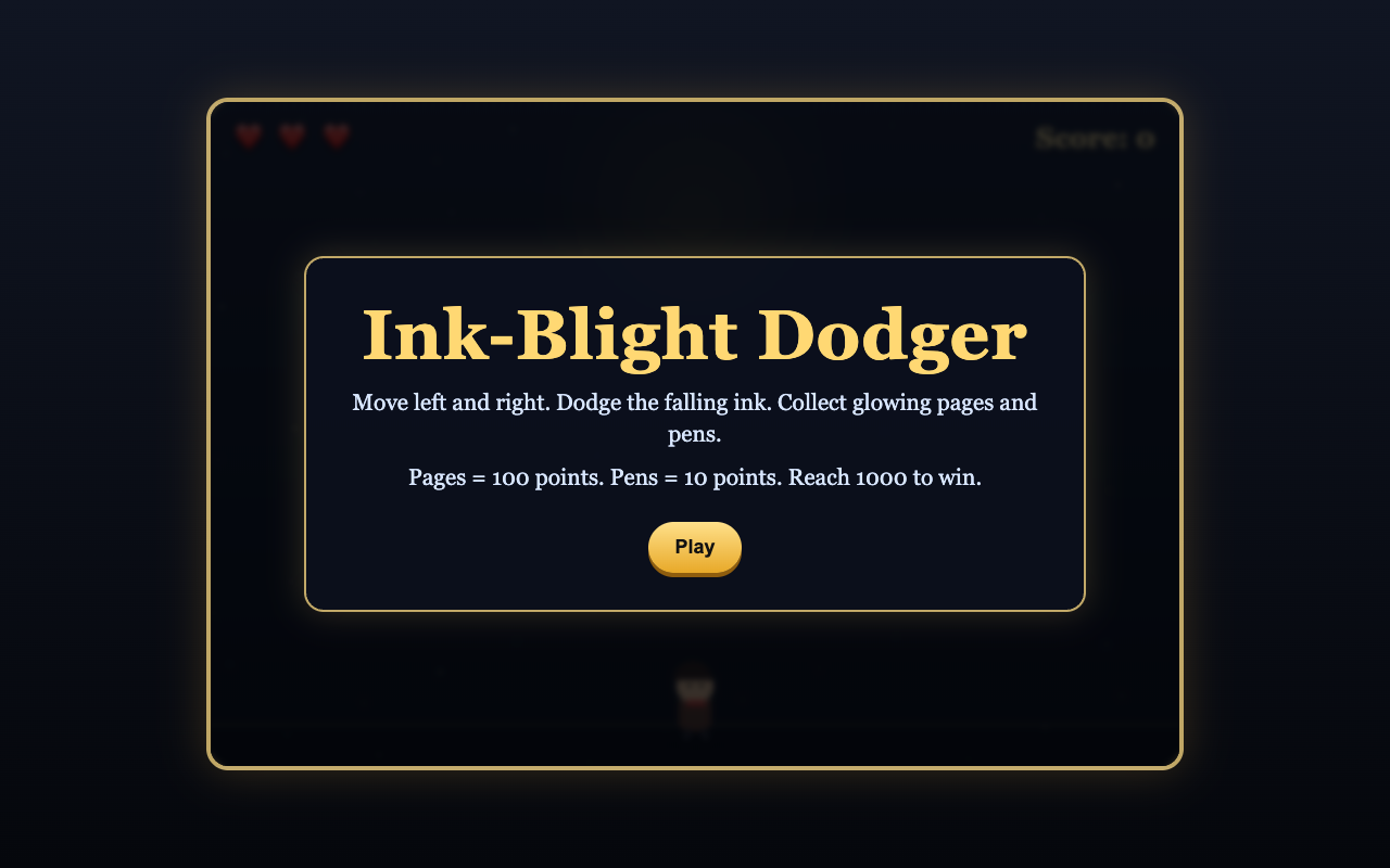
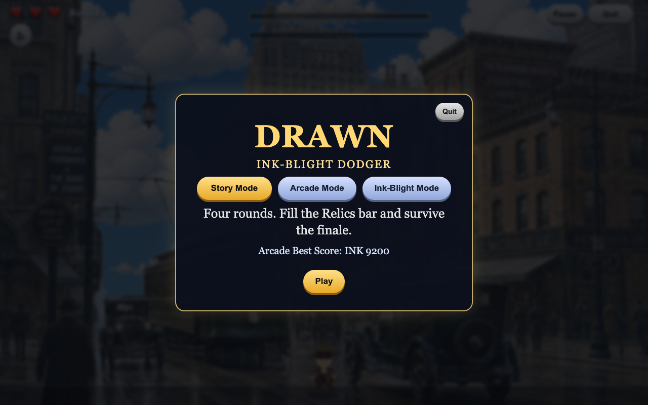
The game grew to include mode selection, jumping and stomping, scene-specific backgrounds, power-ups, and a leaderboard. Throughout development, I focused on how players would understand the interface, distinguish objects, and interpret feedback.
1. Simplify The Entry And Mode Selection
Problem: The selection screen felt busy, descriptions were too long, and explanatory copy repeated an interaction the controls already communicated.
Revision: I shortened the mode descriptions, removed redundant instructions, and added space between the choices and their explanations. I kept Play as the primary action at the bottom and moved Quit to a separate corner position. Gameplay instructions moved into a focused overlay.
Design rationale: The sequence should be clear from the layout: select a mode, understand its purpose, and play. Separating the exit control keeps it from competing with that sequence.
2. Make Collectibles Distinguishable
Problem: A decorative line beside Will's head could read as hair, while pages and pens shared a solid yellow treatment that reduced their visual distinction.
"Instead of just a solid yellow glow across the entire object can we give the pages a white body with a glow around the edges - and the pen a black body ... but with glow around its edges as well - this will help them look different"
Excerpt from my design feedback.
Revision: I directed the removal of misleading decoration and gave the collectibles contrasting bodies: light pages and dark pens, both with glowing edges.
Design rationale: The objects share a magical identity while remaining visually distinct during movement. Color, silhouette, and edge treatment each contribute to recognition.
3. Give A Reward A Clear Gameplay Purpose
Problem: Pip's animation lacked the additional actions needed to complete the intended sequence. Keeping a run-across animation without a meaningful effect would leave the reward underdeveloped.
Revision: I replaced the incomplete animation reward with Ink Power: collecting ten pens grants a temporary period of invulnerability. I requested distinct visual and musical feedback so this ability would feel different from the existing one-hit shield.
Design rationale: A reward should have an understandable purpose and a clear active state. This change matched the scope to the available assets while giving the collection mechanic a meaningful payoff.
4. Preserve Atmosphere Without Hiding Gameplay
Problem: The tree-and-ruins scene was visually appealing but distracting. Later layered scenes introduced excessive transparency, unintended scaling, and misaligned effects.
Revision: I directed a subdued background treatment to keep gameplay visible, limited sky drift and zoom to the appropriate layer, and corrected the flame's scale and position relative to the dragon. I also removed a lighting layer that was not working.
For the flame, I specified brightness variation and bloom while preserving a solid body. Fading the entire flame through transparency changed its visual character and weakened its connection to the scene.
Design rationale: Each layer needed a defined role. Motion and lighting could add atmosphere while the foreground composition stayed stable and gameplay remained readable.
5. Review Behavior Beyond The Attractive Preview
I identified problems that a polished still image would miss: clipped layouts, shifting HUD controls, a sword-pickup freeze, duplicate leaderboard submissions, and the wrong scene appearing before its replacement loaded.
I directed fixes for those behaviors, requested a 60 FPS cap, and adjusted difficulty through small changes in falling-ink speed and quantity. When the Music On label displaced other controls, I requested a compact speaker symbol.
Design rationale: Evaluation needed to cover transitions, gameplay events, and changing screen sizes as well as the opening composition. Specific corrections preserved the intended game feel while addressing individual failures.
6. Direct Generated Art Toward The Film's Visual Identity
Problem: The initial sketch-to-image brief produced a cute cartoon direction that did not sufficiently express Drawn's combination of animated creations and a physical period world. Subsequent backgrounds were also too similar.
Revision: I sharpened the visual brief around one hand-drawn animated creation integrated into a grounded 1920s environment. I expanded the setting direction to include shops, classrooms, farms, clubs, offices, and other period locations, and removed a style reference that was no longer serving the intended direction.
The revised generation instructions specify practical props, depth, cinematic lighting, expressive linework, and cel shading. They discourage generic mascot, mobile-game, and plastic-render treatments.
Design rationale: A useful creative brief defines the relationship between subject and setting, not just a broad style label. The character's idea should inform the location, while the overall image remains consistent with the film's visual identity.
7. Refine The Writing And Protect User Intent
Problem: Generic storybook biographies and invented whimsical origins did not express the intended premise: an unusual cartoon creation appearing in 1923 reality.
Revision: I set a 45-65-word target and directed the writing toward specific sightings, incidents, and reactions. I requested varied structures and coherent character origins, with a clear rule for preserving the visitor's contribution:
"User-provided character facts are primary canon. If the user provides origin, nationality, profession, personality, or backstory details, preserve those details directly. Do not replace them with a newly invented fantasy origin unless the user explicitly asks for one."
Excerpt from my generation instructions.
Design rationale: The writing should build on a user's idea and show how that character behaves in an unfamiliar world. Specific actions and reactions give the text personality; unrelated whimsy and repeated moral summaries weaken it.
I also refined the card's presentation: enlarge the image within its intended frame, keep text clear of the decorative divider, and improve panel spacing. This addressed the relationship between generated content and the layout carrying it.
8. Refine Safeguards Without Flattening Imagination
Problem: The Imaginarium needed family-friendly safeguards, but its initial handling appeared too restrictive for harmless adventure, mythic, historical, and spooky ideas.
Revision: I directed moderation before and after generation, an obvious-name and franchise filter, controlled creative prompts, and encouraging rejection language. I subsequently asked for family-safe concepts such as storybook warriors, dragons, and playful ghosts to remain possible.
The backend combines moderation categories with adventure-context heuristics and explicit unsafe-content terms. It also applies rate controls. Artistic and narrative requirements are expressed through generation instructions.
Design rationale: Safeguards should preserve the intended creative experience while addressing unsafe content. I evaluated restrictive behavior as a product-design issue and supplied concrete examples of acceptable adventure and content requiring rejection.
Design And Evaluation Skills
- Precise critique: identifying the specific visual or behavioral failure and giving actionable corrective direction.
- Art direction: preserving composition, scale, layer order, and the intended character of lighting effects.
- Interaction judgment: separating primary actions, shortening instructions, and making rewards and collectibles readable.
- Scope judgment: replacing an incomplete animation concept with a feasible mechanic.
- Evaluation of AI-assisted work: reviewing outputs over successive builds and catching errors that survived an appealing preview.
- Generative art and writing direction: moving from broad cartoon styling toward a defined hybrid aesthetic, varied environments, and writing grounded in the user's character facts.
- Safeguard judgment: refining overly broad blocking while preserving a family-oriented creative brief, and distinguishing enforced checks from prompt instructions.
One fictional world. Different responsibilities at every step.
Extending a publishing world into discovery and ecommerce while deciding what each interface should communicate and which system should own each responsibility.
Tumbles World introduces books and characters, then supports shopping through a separate Commerce service that owns account, order, and transaction state.
My contribution
I supplied artwork and creative direction, set the product requirements, reviewed builds, and directed revisions to navigation, product presentation, and checkout. I decided which experiences belonged together and which responsibilities needed to remain separate.
AI assistance
Codex implemented substantial portions of the interfaces, service adapters, tests, and documentation. AI also assisted with research and some visual work. I supplied the intent, critiqued the results, and corrected conclusions. I do not claim sole authorship of the code or every image.
Scope: Website and sandbox-commerce implementation. No conversion improvement or production-sales outcome is claimed.
1. Give discovery and shopping different visual jobs
Problem: The Explore area relied on small headings, framing bars, and more description than the cards needed. The store also used the wrong image proportions for a book. A shared brand treatment was not enough to make each destination useful.
Revision: I asked for a clearer text hierarchy, fewer words, character-led imagery, and a direct Learn More action. I separately corrected the store image to use the taller book treatment. Discovery could introduce the world; shopping needed recognizable products.
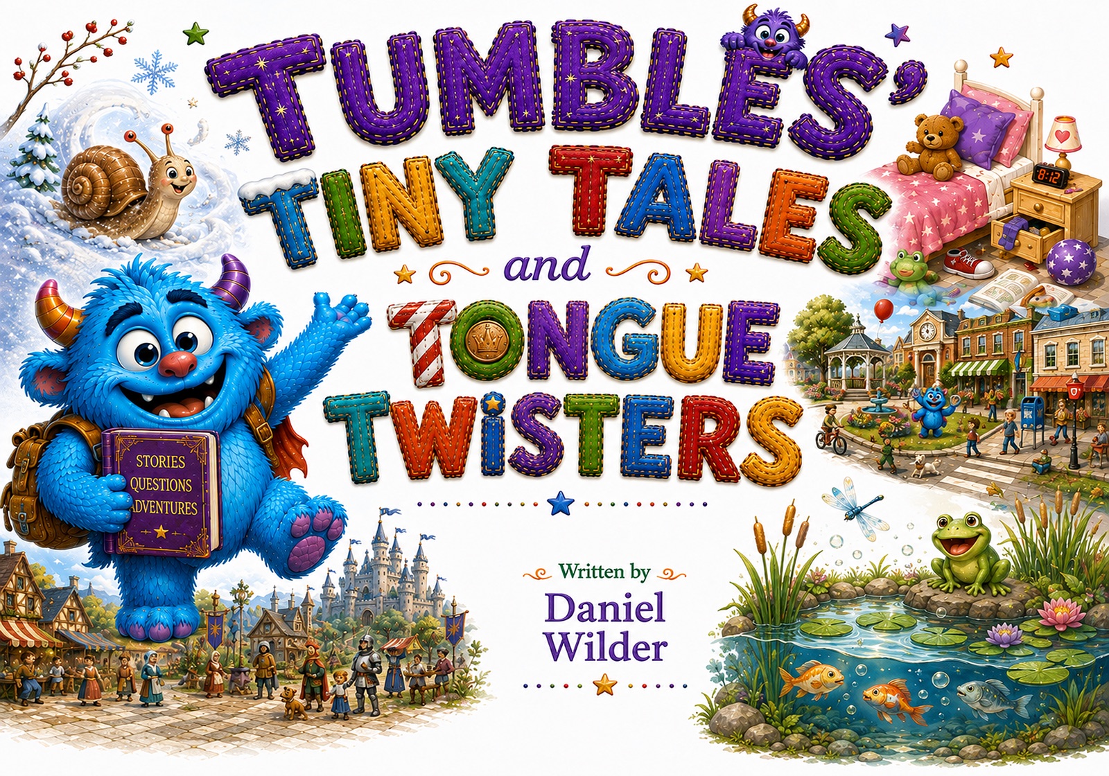
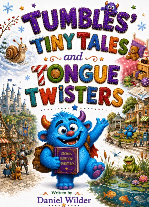
Design rationale: The image should answer the visitor’s immediate question. A story introduction and a purchase decision benefit from different representations of the same book. This extends art direction into information architecture.
2. Remove repeated work without disguising the payment boundary
Problem: During a sandbox purchase, I entered shipping details on Tumbles World and encountered another shipping form at Stripe. The payment page identified the item only as “Paperback.” The flow made me repeat work while giving me too little information to verify the purchase.
“...rather than just saying paperback it should say what the item is.”
My checkout review, October 5, 2026.
Revision: I directed an integrated Delivery → Payment → Review sequence, complete item names, and an explicit final Place Order action. The implementation uses Stripe’s official payment component inside the Tumbles interface. Card entry stays with Stripe; Commerce remains responsible for prices, orders, and payment confirmation.
Enter and confirm the address.
Use Stripe’s embedded card interface.
Inspect items and totals before Place Order.
I later specified that address changes must recalculate shipping and tax before payment can proceed. Saved addresses should help returning customers without removing guest checkout; later address-book edits must not rewrite an existing order.
Design rationale: Continuity is more than consistent colors. It means preserving information across steps and letting the customer verify the exact commitment. The interface must stay understandable while respecting which system owns each decision.
Evidence: implemented checkout source, coordination handoffs, and retained sandbox feedback. No conversion improvement or production-sales outcome is claimed.
Make automated feedback verifiable
Directing an AI-assisted implementation toward feedback a person can locate, understand, and evaluate.
Project context: This example comes from an ongoing private product I am developing. The case focuses on one broadly applicable review interaction and omits identifying terminology, unpublished writing, product-specific mechanics, source code, and system design. The reconstruction below uses invented sample text rather than a working-product screenshot.
My contribution
I reviewed the working interface, identified where its feedback failed in context, defined the correction, and evaluated the revised behavior. When the first correction improved most cases but failed on the example that exposed the problem, I did not treat partial success as resolution.
AI assistance
Codex implemented the interface and debugging changes, traced the position mismatch, and ran development checks. I directed the experience and judged whether the result met the intended behavior; I do not claim sole authorship of the implementation.
Problem: A review suggestion sometimes showed only a tiny fragment of the original text and highlighted an unrelated nearby word. The recommendation and the document no longer appeared to refer to the same place.
“notice this is highlighting the wrong thing”
My review of the working interface.
Revision I directed: I asked for the complete sentence to appear with each suggestion and for the corresponding passage to be highlighted in the document. I also removed internal scoring and implementation metadata that did not help the writer decide. After the first correction, I reported that most items were improved but the original example still failed, requiring the location mismatch itself to be investigated.
Design rationale: Automated feedback is only useful when a person can verify what it refers to. Sentence context supports interpretation, accurate highlighting supports trust, and removing internal system language keeps attention on the decision rather than the machinery behind it.
Mara closed the window. The room fell quiet as rain traced the glass.
Original
rain traced...Mara closed the window. The room fell quiet as rain traced the glass.
Original sentence
The room fell quiet as rain traced the glass.Reconstructed demonstration using invented text—not a screenshot of the private working product.
Supported status: The AI-assisted implementation added sentence-level context, location-aware highlighting, and checks that compare a stored issue with the document text before marking it. The surviving work demonstrates the implemented review flow. No usability improvement is claimed, and the final edge-case correction was not subsequently confirmed in a recorded user review.
What this work demonstrates
Drawn shows how I critique visual output, gameplay, and generated writing. Tumbles World adds decisions across customer journeys, interface hierarchy, and commerce boundaries. The private prototype adds a close reading of automated feedback: whether a person can understand it, locate it, and decide what to do with it.
My contribution is the creative and product judgment that guides AI-assisted execution: recognizing what is wrong, describing what should change, and resisting a plausible result when the evidence does not support it.